Oh, the love hate relationship I have with our master bathroom. I dream of the day I can soak in our salvaged claw foot tub, surrounded by freshly painted wainscoting, basking in the glory of the beautiful Carrara marble and sparkling polished nickel fixtures. But sadly, those days are still months and roughly 142 "to do" list items away from being even close to a reality.

While Alex has been toiling away on restoring the drafty and disgusting window in the room, I've been no slouch on my own. Rather than sitting idly by in the bullpen waiting for a construction task, I've been immersed in the world of tile and fabric, a world both exhilarating and overwhelming all at the same time. A world where color, pattern, and inspiration abound, but seeds of buyers remorse and indecision creep up like the tendrils of ivy on our courtyard wall. 

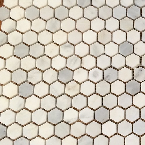
Truth be told, I've been hunting for a suitable tile (well, stone to be exact) option for this room for years, and though many potentially viable candidates have presented themselves along the way, I have never swayed from my desire for a Carrara marble hexagon tile. I've spent a fair amount of time poring over samples from various stores, and for a short time even debated a 1" vs. 2" mosaic, but I feel I've finally settled on a winner. Although larger format tiles would be more practical in a room of this size (from both an installation and grout maintenance perspective), I'm a purist at heart. I know our bathroom redo won't fool anyone into thinking it's an "original" bathroom in our 1880s victorian, but I'd like to pull in some elements that one might have found in a home of our age so it looks and feels more appropriate to the period. My desire for a somewhat historically accurate material selection helped me rule out the 2 inch hexagon. 

Primarily I've been researching various online companies in addition to visiting local stone showrooms, and I've purchased an array of 1" honed Carrara marble samples to choose from. From my experience, I can highly recommend ordering samples from different companies because you get a better feel of the product's color and shading, variation and prominence of veining within a sheet, and the thickness of the tiles themselves. In most cases, samples run approximately $5-$10 each with free shipping. If you ask me, I think that's a very reasonable price when making such an expensive purchase, especially for a large room. 

Ordering the samples has helped us to narrow down the company we'd like to use (I'll be sure to share the name once the order is placed and tiles arrive to our satisfaction), and I feel that's one big item we're able to mark complete on our design checklist.

If you've been following along, you may remember I've also been wrestling with fabric options. I have to send out a huge thank you to everyone who commented and suggested great resources for fabrics. I spent a lot of time researching these sites, as well as borrowing fabric swatches from local stores. The number one goal I've been shooting for is a fabric that will work well with our slightly off white trim and will pull in shades of gray and turquoise that will work well with our adjoining master bedroom color palette.

Last week I came home armed with a variety of swatches, and held them up against a tile sample and the trim color we'll be using in the space. Here's a glimpse into my list of final contenders:

While I liked the fabric below in the store, the background looked too creamy against the cool undertones of the tile. I also decided I wasn't crazy about the pattern, specifically the sand dollar looking blob that's part of the repeat. I'm rather certain that I'd pretty much stare at that item and that item alone once it was in a much larger setting.

A second choice that appealed to me in the store I also quickly ruled once I had it home. I'm not sure why, but I tend to be drawn to stripes both in my decorating and personal wardrobe, but I already have striped curtains in our bedroom, and these stripes are totally different than those stripes, so we'd just have competing stripes all over the place. While I loved the color and had entertained the idea of hanging the stripe horizontally rather than vertically, I ultimately felt it would have brought in just too many stripes, especially next to the vertical lines of the wainscoting. 

The third fabric I laid out finally started to jive a bit better with the feel I'd like to achieve. It's fun, whimsical pattern appealed to me and I love the deep charcoal berries as well as the softer shade of gray in the leaves. While I can't say this is the one and only, it's definitely one of the front runners of the bunch and still has a chance with the selection committee.

Now that we've broken the ice with a genuine contender in our list, let's hope for a few more winners. This next fabric I really love as well in terms of its simplicity and more classic design, but the fabric is limited to colors of ivory and turquoise only. I think the gray would still work, but I'd feel better about it if it had a bit more color variation.

Okay. I'm going to be honest here and tell you that I'm totally obsessed with this next fabric! I love that it's not too masculine, not too feminine, and it's still a strong and simple pattern. I want to love it so much and feel I should drape it all over the bathroom, but back to my earlier point about color, I'm not sure if it's colorful enough for what I'm going for. So this lovely gem of a pattern may not work in our bathroom, but, hmm, I wonder if I can make it work in our living room? Maybe it's time for a little refresh in there. Wait, what am I saying?? Must. not. start. another. project.

This final fabric we're considering is what I'd call "imitation crewel." If you've not heard of crewel before it's when the design is intricately stitched into the fabric rather than printed onto the fabric, but it's quite expensive. This particular sample looks like the more expensive crewel fabric (Alex actually thought it was the real thing) and I love the colors! It has several shades of gray, the ("pop" is simply overused) of turquoise that I love, and it even offers a bit of an acid greenish yellow. This little fella is currently is sitting atop our fabric selection bathroom picks.

Seeing the fabrics in person, next to the future tile and trim color really help with the decision making process. From my experience I can tell you that choosing fabrics and tile can be overwhelming when you don't know where to start or which direction to head, but now that I'm narrowing in on my preferred look and design, I feel I have some really good options that could work quite nicely. While we're not to the point of clicking the order button just yet (my finger is nervously quivering above the mouse, I assure you), I'm thrilled to be to a point where I'm making some big time design decision progress in our project. It sure beats spending my time descending the basement stairs to pay a frustration-inducing visit to my dusty claw foot tub. One day my cast iron friend, one day.

Do you have an opinion on the fabrics shown above? Or do you have a go to tile or fabric resource that you'd like to share? I'd love to hear your two cents.

Comments 45

Comments

Elaine
11/11/2013 at 10:37 AM

I love the last two fabrics. The last one in particular seems like an old-ish pattern that's been updated with more current colors, but nothing garish. And then the grey pattern is just lovely.

Wendy
11/11/2013

Thanks, Elaine! That's a really good point about it being a more traditional pattern with more modern colors. A new take on an old classic? Sounds like what I'm trying to accomplish!

Jan
11/11/2013 at 10:40 AM

The last two are the best! You'd be fine with either one, I think. Can't wait to see the finished bathroom.

Wendy
11/11/2013

Thanks, Jan. I really appreciate your input!

Cheryl
11/11/2013 at 10:59 AM

My first pick = #4 - I wouldn't worry that it doesn't have any gray in it.

My second pick = #6 - which is kinda crazy since I hate that acid lime color.

I like #5 but I think you need to have more color in the bathroom.

Hope Alex has filled in the window so that you guys are staying warm!

Wendy
11/11/2013

Thanks for your votes, Cheryl! And I'm thrilled to report that as of yesterday afternoon, the bathroom window sash are back in! There's still a lot of work to be done, but it's not just a plastic barrier.Alt smile

KarinK
11/11/2013 at 11:18 AM

I vote for the last one. I can't wait to see it finished!

Wendy
11/11/2013

Great! Thanks, Karin!

Pat
11/11/2013 at 11:33 AM

I like those last four fabrics. If something isn't as colorful as you like, you could always add a ribbon (or even fabric) stripe of a contrasting color. Or a colorblock of solid color at the top or bottom of the panel. That way you could make that awesome geometric work.Alt smile

Wendy
11/11/2013

Great suggestions! Thanks, Pat!

11/11/2013 at 2:02 PM

Good luck with your final fabric selection! I'm especially fond of #4, but #3 is close behind (I actually had them switched when I started writing this comment and then changed my mind, ha!).

Wendy
11/11/2013

:) I keep flip flopping too! Thanks for your input, Ashley!

Kelly
11/11/2013 at 2:22 PM

I love all the fabrics, but I think the geometric one, second to last, would fit best in your house. It's not too compete-y. I like the blue & ivory one though too. I love the florals but they don't seem "bathroom"-y enough to me if that makes sense? I like the blue & ivory pattern one as well, but you're right, it needs some kind of contrasting color.

Wendy
11/11/2013

I really do love the geometric pattern! If it doesn't end up in the bathroom, I will definitely find a place to put it in our house! Thanks for your feedback, Kelly.Alt smile

Anita
11/11/2013 at 3:20 PM

i like 3, 4, & 6. my favorite is #4.

would you mind posting more details on the fabric? the 3 i listed could be great options for my master bedroom curtains.

thanks!

Wendy
11/14/2013

Thanks, Anita, and sure, I'd be happy to share more details about the fabric. Number three is called "Capparis Sunshine," and if you google it, multiple online retailers will pop up.

mia
11/11/2013 at 4:21 PM

First, so relieved to hear your window is back, considering the expected drop in temps.
I like the pattern and colors in #3, but it seems too casual for your home. So I nominate #6; I love the turquoise in it. Mia

Wendy
11/14/2013

Me too! Having the window out last week was no fun at all!

Thanks for your vote. I love them all for different reasons, but really like number six as well.Alt smile

JC
11/11/2013 at 7:48 PM

I prefer the colours and general feel of the first fabric, but I don't like the pattern that much. It looks a bit cartoony/naive. I do like the last one though, which has very similar colours, but a much better looking pattern.

I also really like the bold geometric one. I think if you wanted to use that one, maybe you could do a border or a stripe in the turquoise (for your pop of colour). Depending how it's done, it could look really cool and fun, or it could be a flop. You'd need to experiment with possible layouts (or just play around with it in Photoshop).

I don't know if you checked out "Online Fabric Store" or not. I know they carry a pretty wide selection of drapery and upholstery fabrics. They might have a selection of similar fabrics as the ones you're mulling over. I can tell you that their prices are awesome. We have fabrics in our shop (I'm doing upholstery now) that we can't even buy from our suppliers as cheap as their prices. An example would be a fabric that we can only get for 40$/yd wholesale, and they have the exact same fabric for 20$/yd retail.

Wendy
11/14/2013

Thanks for your vote, JC! I totally agree with you on the first fabric -- love the colors, but the pattern...not so much.

I have checked out Online Fabric Store and their prices are crazy good! I can't believe their prices beat what you can get wholesale!

Mary
11/11/2013 at 8:12 PM

I vote for #5, the geometric that is second to last. I don't think your fabric needs to have a second (or more) color, and of all the ones that geometric jumped out to me immediately. It is not too modern either--there is something that is a bit chinoiserie about it, which I think complements the classic feel you are going towards. I could see you mixing in other natural elements for color, like a wood tone and even boxwood for some nature.

Wendy
11/14/2013

Thanks, Mary! I'm absolutely in love with the geometric fabric, and if I don't decide to use it in the bathroom I'm going to have to find another use for it somewhere else!

11/11/2013 at 10:45 PM

The imitation crewel is my favorite. I like the mix of colors and think it will reall help pull them all out in the room.

Wendy
11/14/2013

Thanks, Jessica! I appreciate your input, and it's still the frontrunner for me too.Alt smile

Michelle
11/12/2013 at 9:05 AM

I like the last one!

Wendy
11/14/2013

Thanks, Michelle. Me too!Alt smile

11/12/2013 at 10:20 AM

Love the imitation crewel too. Love the gray that you love too but agree - it's going to be a pretty... gray... in there when all is said and done.

Wendy
11/14/2013

Thanks, Melissa! As much as I love the geometric, I think I really need to pull in some color so the room doesn't feel too cold.

11/12/2013 at 11:47 AM

I love the gray geometric fabric, second from the bottom, I believe. Since you (seem to) love to decorate for various holidays, I see it transforming really beautifully from summer to autumn to winter, etc, etc. You could get really crazy with the accessories!

Wendy
11/14/2013

What a great point, Amanda! That geometric could look so beautiful alongside fresh evergreen for the holidays, pumpkins and gourds at Halloween...

You have me dreaming!

Lena
11/12/2013 at 4:22 PM

I love the last one. Would you mind sharing where it is from? Ie manufacturer. I'm thinking if the turquoise would go with the walls in my laundry that would be the fabric for me there.

Wendy
11/14/2013

I'd be happy to share! It's called "Ladbrooke Peacock" and if you google it, you'll find many online retailers that sell it. Good luck with your laundry room project, Lena!

Lena
11/18/2013 at 10:31 AM

Thanks so much for the info!!

bfish
11/12/2013 at 11:03 PM

I like the last fabric best. A few people suggested adding solid color panels at the bottom; my (non-expert) opinion is that look will be dated soon if it's not already. When in doubt, go for the classic, especially in your classic old house, unless you want to replace curtains fairly frequently to "stay current".

Personally I would use shutters (or nothing if no one can see in) as I'm not a fan of window treatments, other than the most minimal. Sorry, I'd rather let all of your other beautiful finishes and decorative items carry the load in providing interest and color.

Wendy
11/14/2013

Thanks so much for your input! Good point about the solid panels. We're pretty classic in our taste, so the more I think about it, the more I'm leaning toward the last option.

We will actually have shutters in the window as well. The original wood shutters from the 1880s are safely stowed away, just waiting to return. They're only on the lower sash though, so I want the full length panels for added privacy and warmth.

KarinK
11/13/2013 at 2:50 PM

OK - I am back. After I read this post and commented, I was flipping through the November-December issue of Veranda (any chance you have it?) and there is a canopied bed on page 110, draped in fabric that immediately made me think of you. It is from Chelsea Textiles, and best I can tell from some internet sleuthing, it is called "Tree of Life". All the internet pics I see don't look nearly as good as the magazine shot. Just an idea - the pattern may be way too large for your needs. Best I can do with a link - third and fourth photos on the page http://quintessenceblog.com/at-home-with-susanna-salk-and-robert-couturier/

KarinK
11/13/2013 at 2:57 PM

Me AGAIN! I found the link to the manufacturer: http://www.chelseatextiles.com/us/fabrics/collections/tree-of-life/garden-of-eden.html

Sorry - can't help myself!Alt smile Now I'm thinking my house needs some of it.

Wendy
11/14/2013

Thanks, Karin! It was so nice of you to share the magazine pages as well as research the fabric! That bed is amazing!!

11/13/2013 at 3:41 PM

I think that the one with stripes look nice, because it will be rather practical in use. But of course if you have too many stripes in your décor you should choose something else. The last one is very cute.

Wendy
11/14/2013

Thanks, Maria! I definitely have a thing for stripes.Alt smile

Anita
11/19/2013 at 10:56 PM

thanks for the name for #3. could you tell me #4 & #6 also?

thanks again!

11/28/2013 at 12:01 AM

I love the last fabric. It is really cool and so pleasing to the eyes. And its prints are really perfect for your tiles.

11/28/2013 at 12:03 AM

I love the last fabric. It is really cool and so pleasing to the eyes. And its prints are really perfect for your tiles.

Lauren
12/10/2013 at 3:54 PM

I would love to know where you found the tiles as well as any others you considered/liked when they are delivered!

Since you've not signed in yet, you will need to fill in your name and email below. If you have a Facebook account, save yourself a step and use Connect to login.

Denotes a required field.

Please enter full URL, including http://

You can use Markdown syntax in your comment. And you can also use lots of Emoji!
  • Search

  • Login
  • Follow
  • Advertising

If you're looking for information on advertising and sponsorships, head on over to our sponsorships page. You can purchase site sponsorships in a few easy clicks. 

Toolbox Tuesday
Open Housing
  • We're Featured!

Old Town Home has been featured in the following places and publications:

The Washington Post
 
Washingtonian Magazine
 
Domino
 
Old House Journal
 
 
Apartment Therapy House Tour
 
Washington Post Express Feature
 
Home & Garden Blogs
 
© 2024 OldTownHome.com. - Privacy Policy
Login Below
or
Sign in with Facebook
Connect

Unexpected Error

Your submission caused an unexpected error. You can try your request again, but if you continue to experience problems, please contact the administrator.

Working...

Working...